(A book blog meme hosted by Librarian Mouse. To participate and for more info, click here)
More book covers! Because let's be honest, we all judge them. It's one of the first impressions we get on a book. This time I'll be sharing and comparing the worldwide covers to the book I am currently reading.
Pure by Julianna Baggott
Above is the USA and Canada cover. I love the simplicity of the cover; it's one of the things that first drew me to this book. (My boss recommending it is what ultimately made me pick it up, but then I went home and went to add it on Goodreads, only to realise I already had!)
The UK paperback cover is pictured above. Not my favourite, but I love the font!
Another UK paperback cover that was released several months after the first printing. Very fiery and eye-catching and sure to draw in Hunger Games fans.
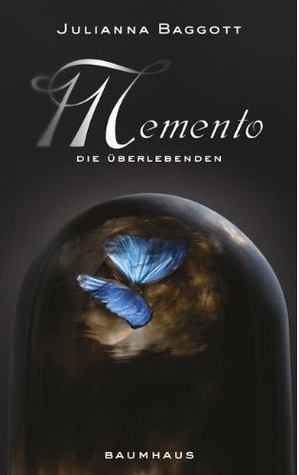
The German cover. Basically the same as the American cover, but in German.
The Italian cover. The colour pops out a little bit more on this one.
And above is the Polish cover, which is very different from the others. Still a great design!
So which cover is your favourite?
I personally am attached to the American cover, probably because it's the one I'm reading. Let me know your thoughts in the comments!


0 comments:
Leave a comment...
Thank you so much for taking the time to comment and for sharing your thoughts! Feel free to link me to your blog as well so I can return the comment love :)